This was a full brand redesign for Vincenzo's, a family run Italian grocery store in Waterloo. I did a complete overhaul of their logo and marketing materials, and I changed the name as well.
I wanted to do this because there was really strong audience space here, but the brand was speaking mainly to an older demographic. So we tailored the redesign to target a younger customer base and create a space that everyone can enjoy going to.
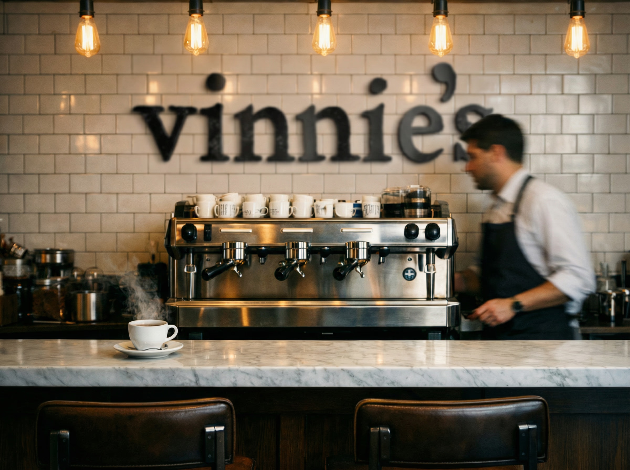
How I Critiqued the Brand
Before designing anything I needed to know what I was actually working with. So I compared Vincenzo's directly to Eataly, a big Italian grocery competitor in downtown Toronto and across the world.
The thing I had to be careful about was not throwing away what worked. They had a very loyal customer base, a very authentic in store experience where the staff know your name, and really strong social engagement with their existing audience.
The Direction I Chose
Once I knew the problem, I had to pick a feeling to design toward. I decided I wanted Vinnie's to feel like a third place.
A third place is common now with a younger demographic. It's the gym, a coffee shop, your favourite bar. It's not quite home and not quite work, but it's the place you look forward to going after you get off work. That was the goal. Then I needed to figure out how to make that feeling specifically Italian, so I created something called Nonna's table. The idea was that walking into Vinnie's should feel like sitting down at your grandmother's table.
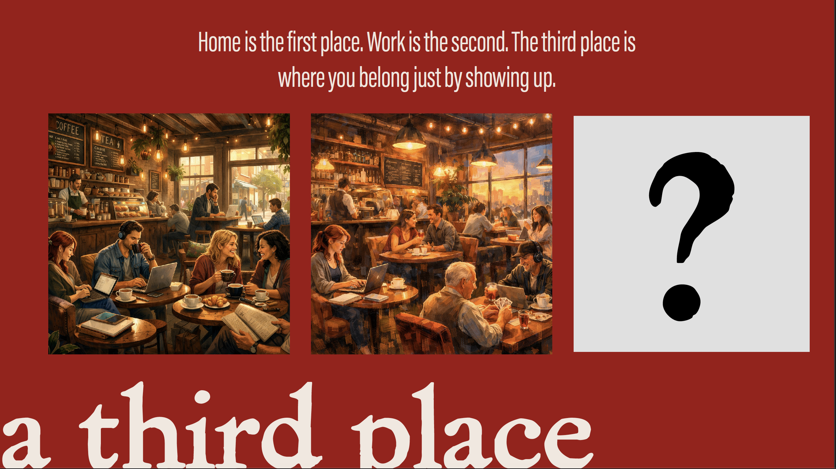

Every design decision after this point answered one question: does this feel like I'm pulling up a chair at Nonna's table? If it didn't, it was wrong.
Designing the Name and Logo
A big inspiration here was the Cal & Gary's logo from Calgary Co-op. Stealing inspiration from how friendly it made their brand and products feel. They basically personified the entire brand, everything vibrant and friendly. I wanted to do that with the Vinnie's brand.
Originally I was going to use "Vinnie's" as a side brand of their products exctly how Cal & Gary's did it, but then I figured why not just change the whole company to match this brand instead. So that's what I did.
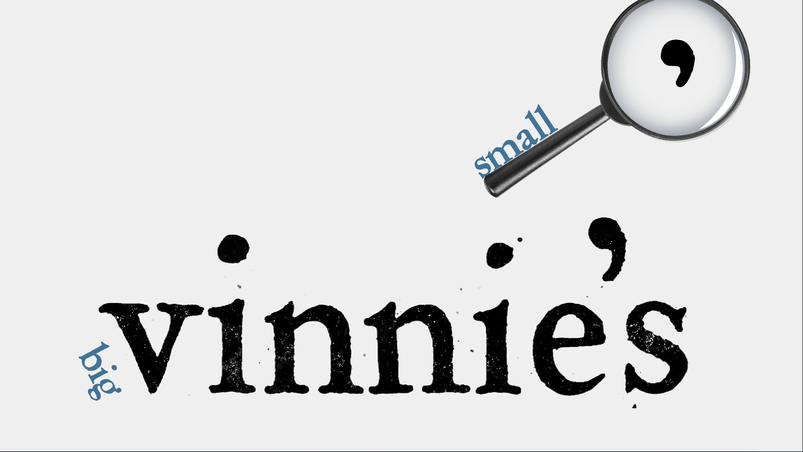
For the wordmark I chose a typeface called Powell because it feels personal, like Vincenzo himself wrote it.
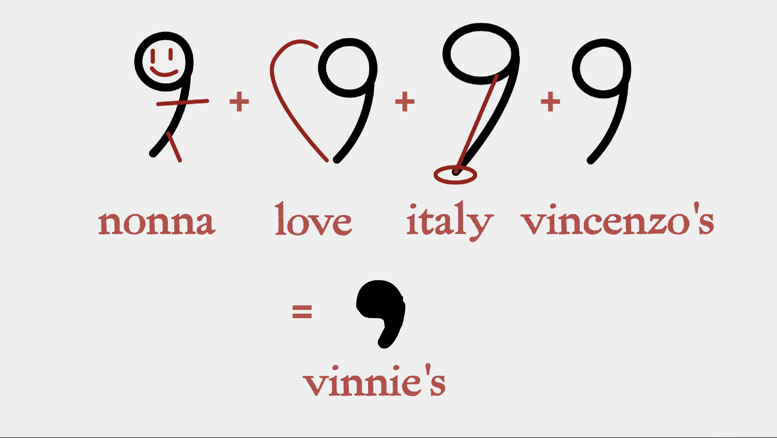
The small logo is where I had the most fun. The apostrophe stood out to me while I was messing around with tweaking the font. But then I started to really think about the meaning of the apostrophe. An apostrophe shows possesion, and how something is someone's. So in Vinnie's case it keeps Vincenzo himself in the logo and keeps him in the company. It shows he's still part of it. It's still his store, still his possession. Reading through the logo breakdown (like the Airbnb logo breakdown) shows how family, love and italy all combine together to really strengthen the logo.
Building the Store Mockups
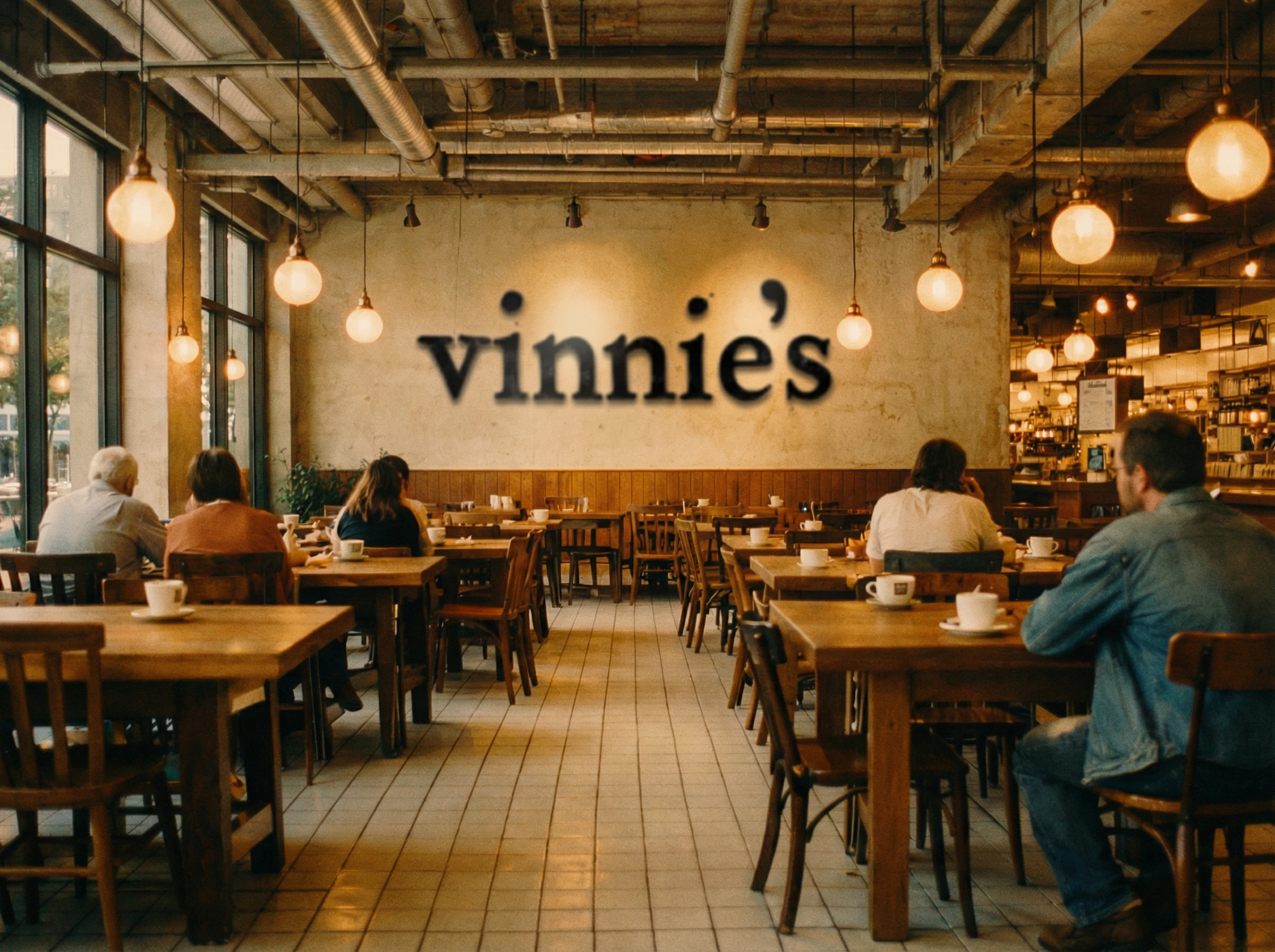
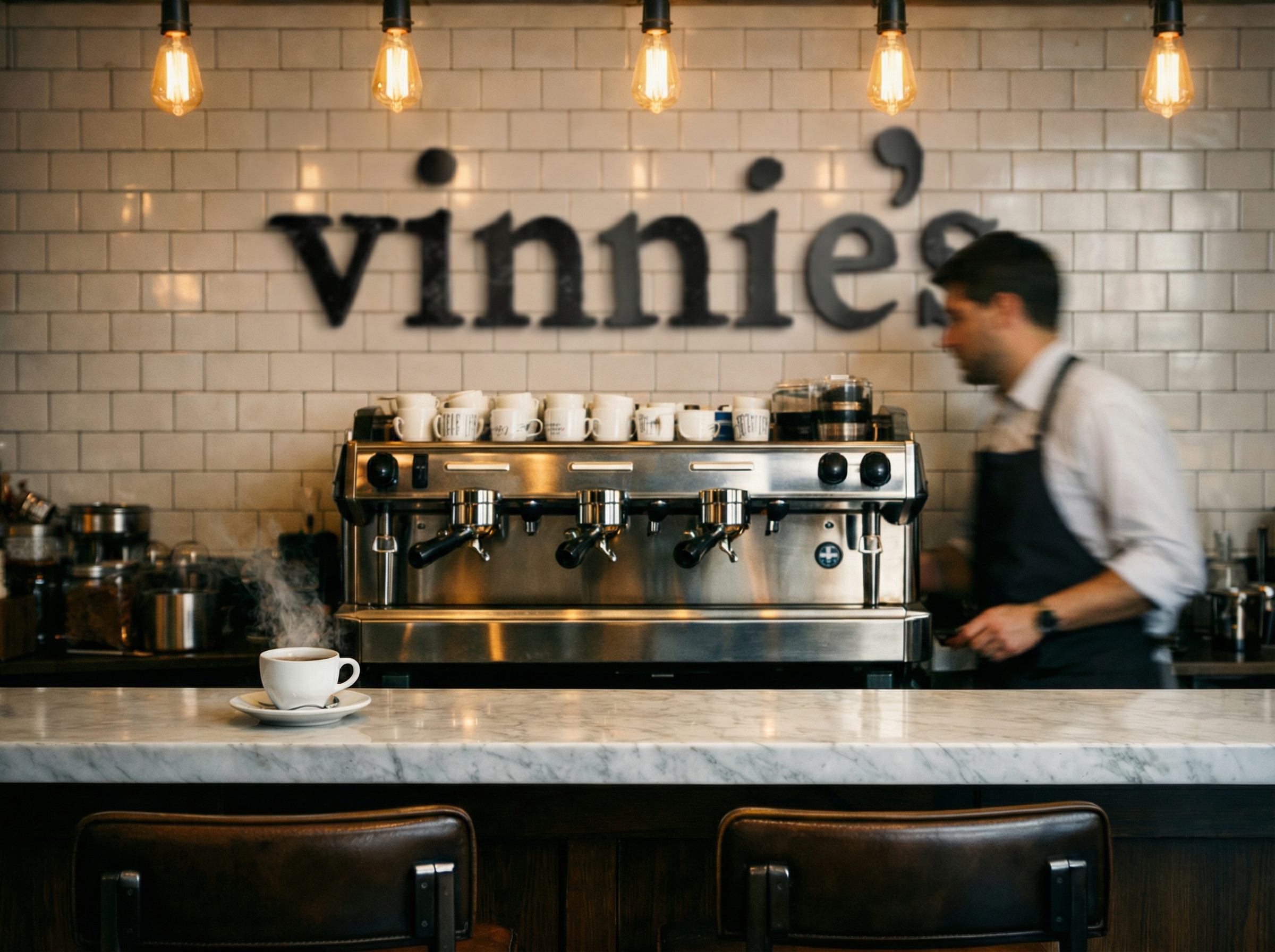
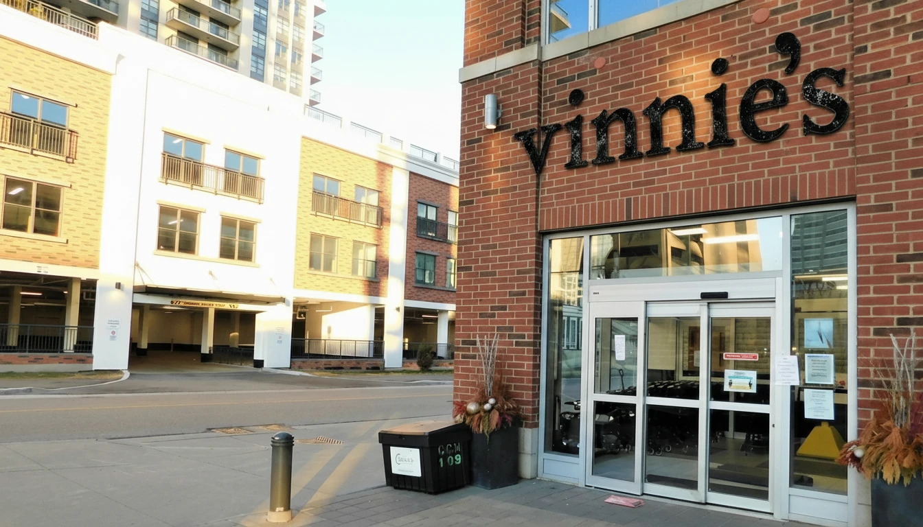
The store mockups were definitely the hardest part. You have to be very clear with what you want and understand exactly how the space should look and feel like.
I build each store mockup in three parts. First you must understand the space better than any AI tool will be able to describe. You need to know how it should look, feel, sound, move. Then you build the space with AI using inspiration photos, mockups, and your best descriptions. Finally you take the raw store images and place the logo on top. I was super happy with how these turned out and how realistic they look!
Building the Product Mockups
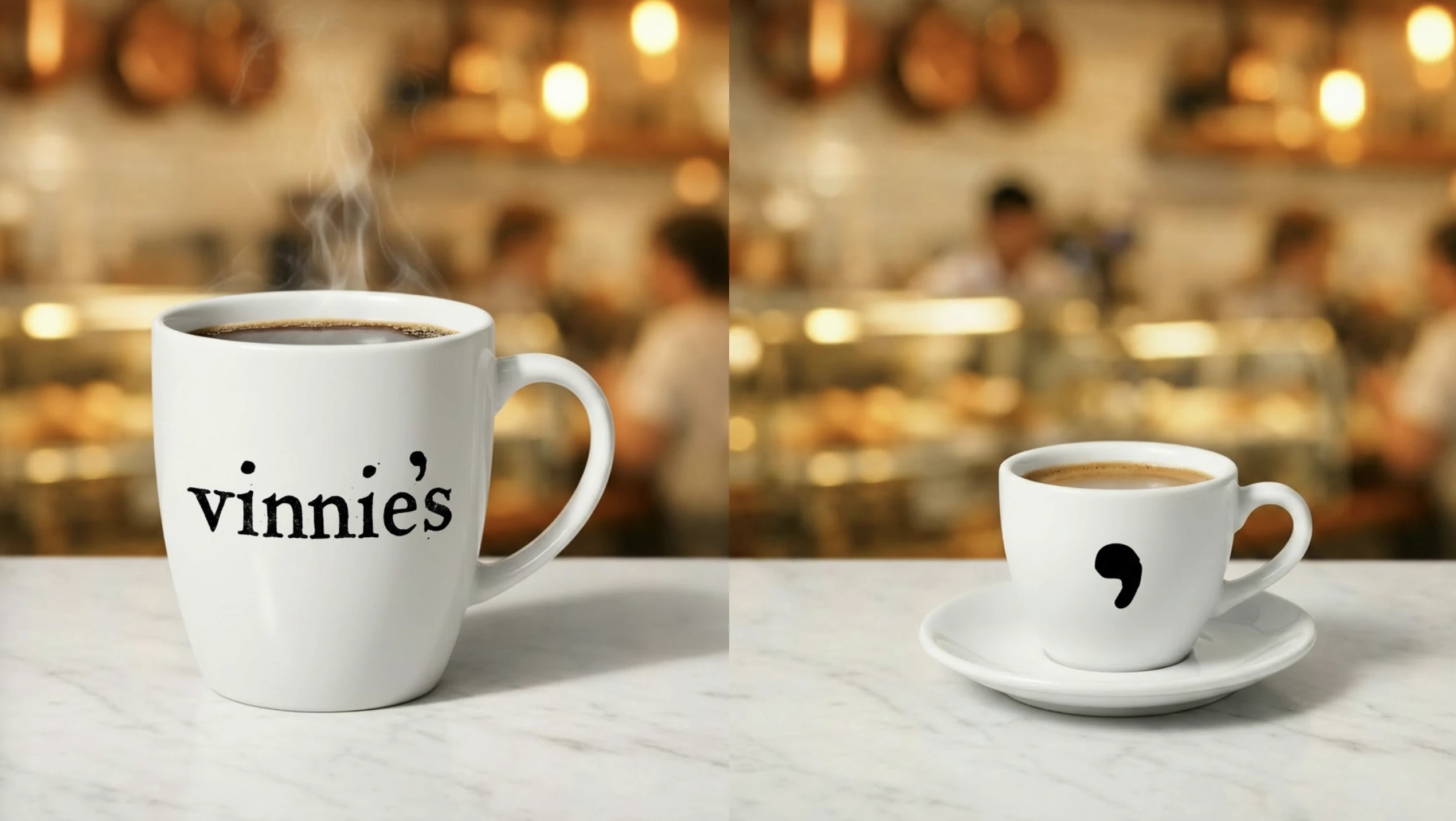
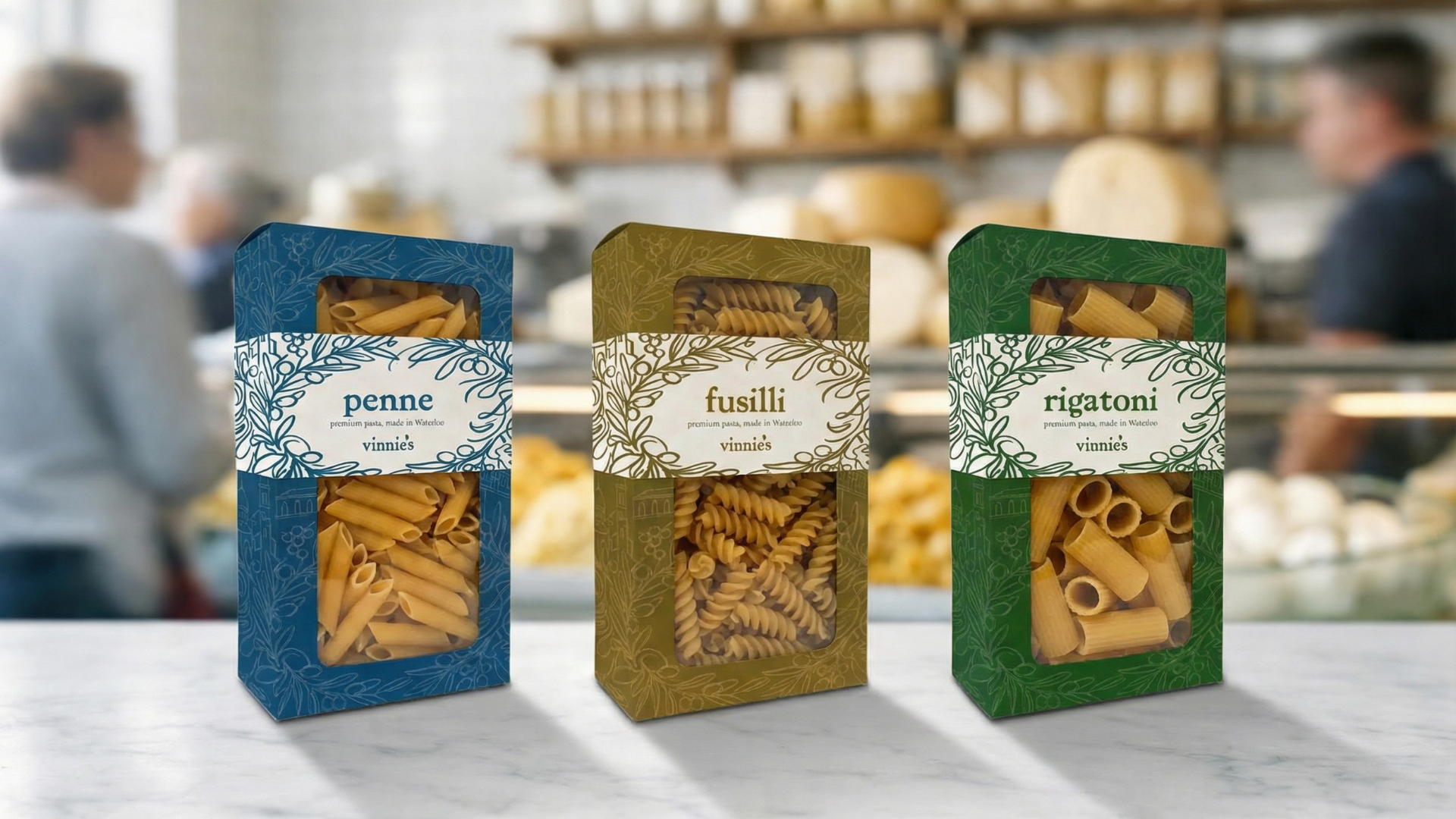
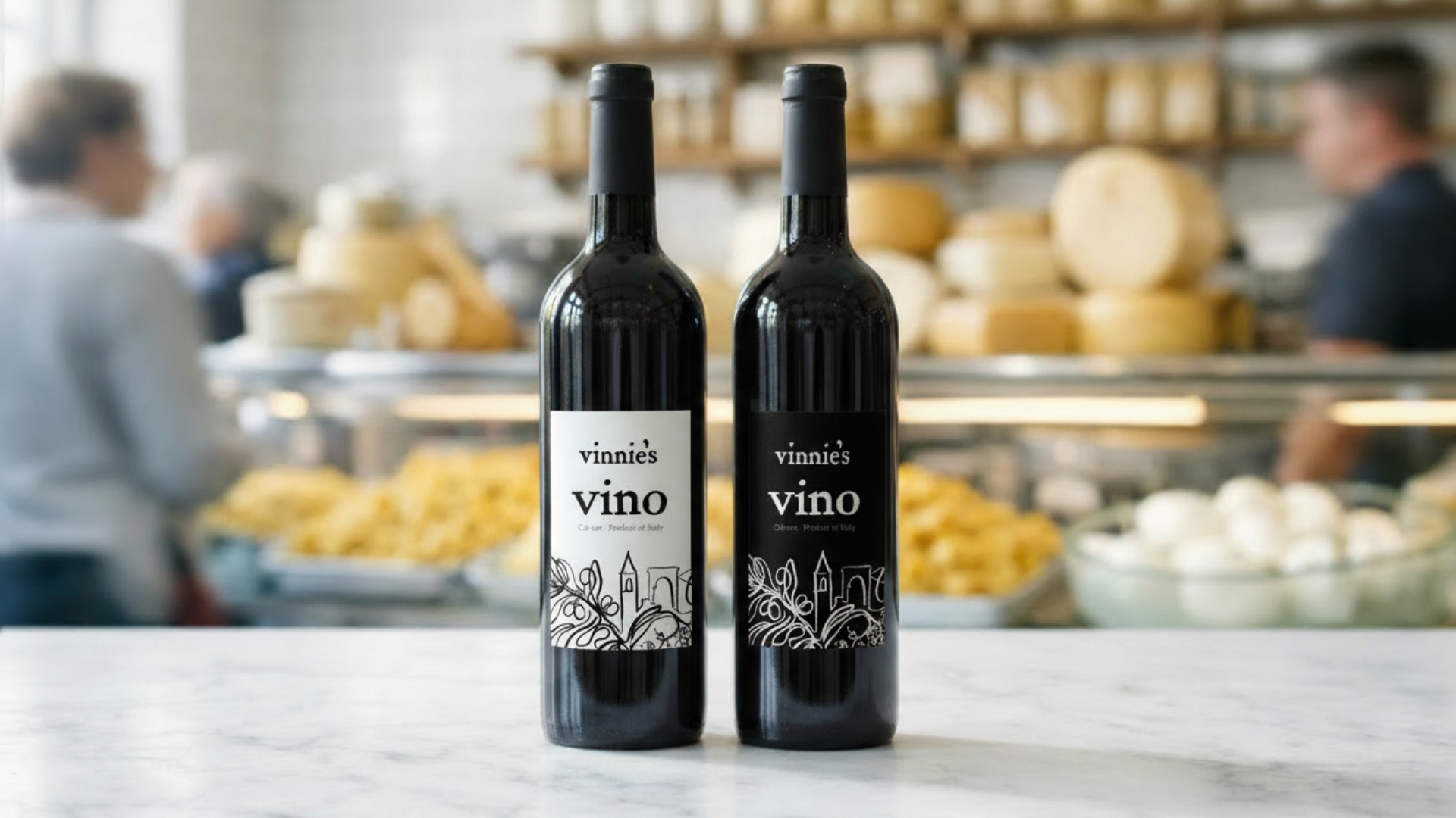
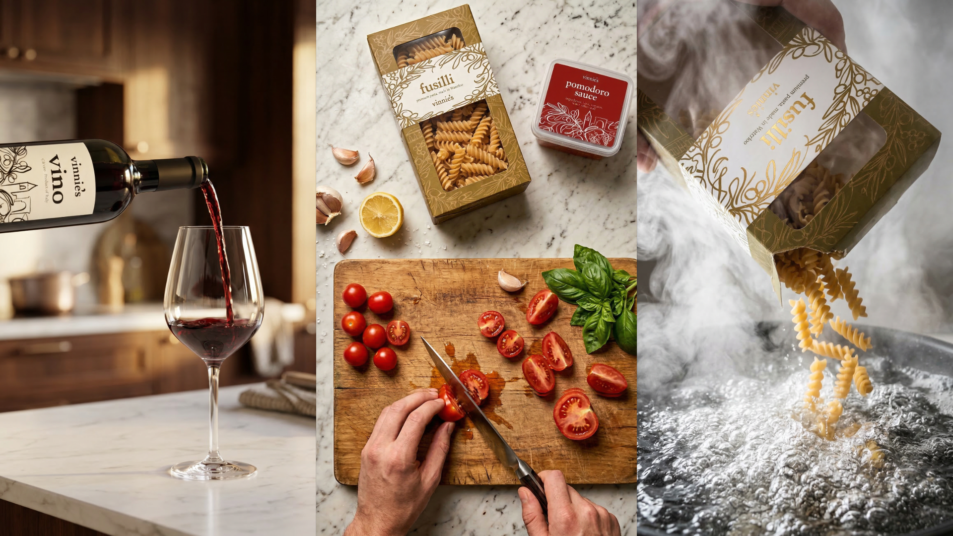
For the products, it's important to note that I designed the covers separately first and then composited them. I'd create the label on its own, then bring it into Firefly and use Nano Banana to put it onto a real product. Doing the label and the object separately is the only way to prevent halluncinations and garabge quality.
Social Media Videos
Click play to watch each of the videos. This is a very practical way to build mockups in a few hours. Obviously they aren't as perfect as shooting in real life would be, but for a short turnaround client pitch they do the job. To build these you need to first generate start and end frames for each shot. Simpler shots work better. Then animate them using whatever AI Video model is the best. And finally put it all together in a premiere pro timeline.
Final Notes
If you want to see the full pitch I presented and submitted, it's published in full below. The proof of work goes deeper, it documents every design decision and walks through the actual prompts and workflows behind everything you've seen here.